Kaster
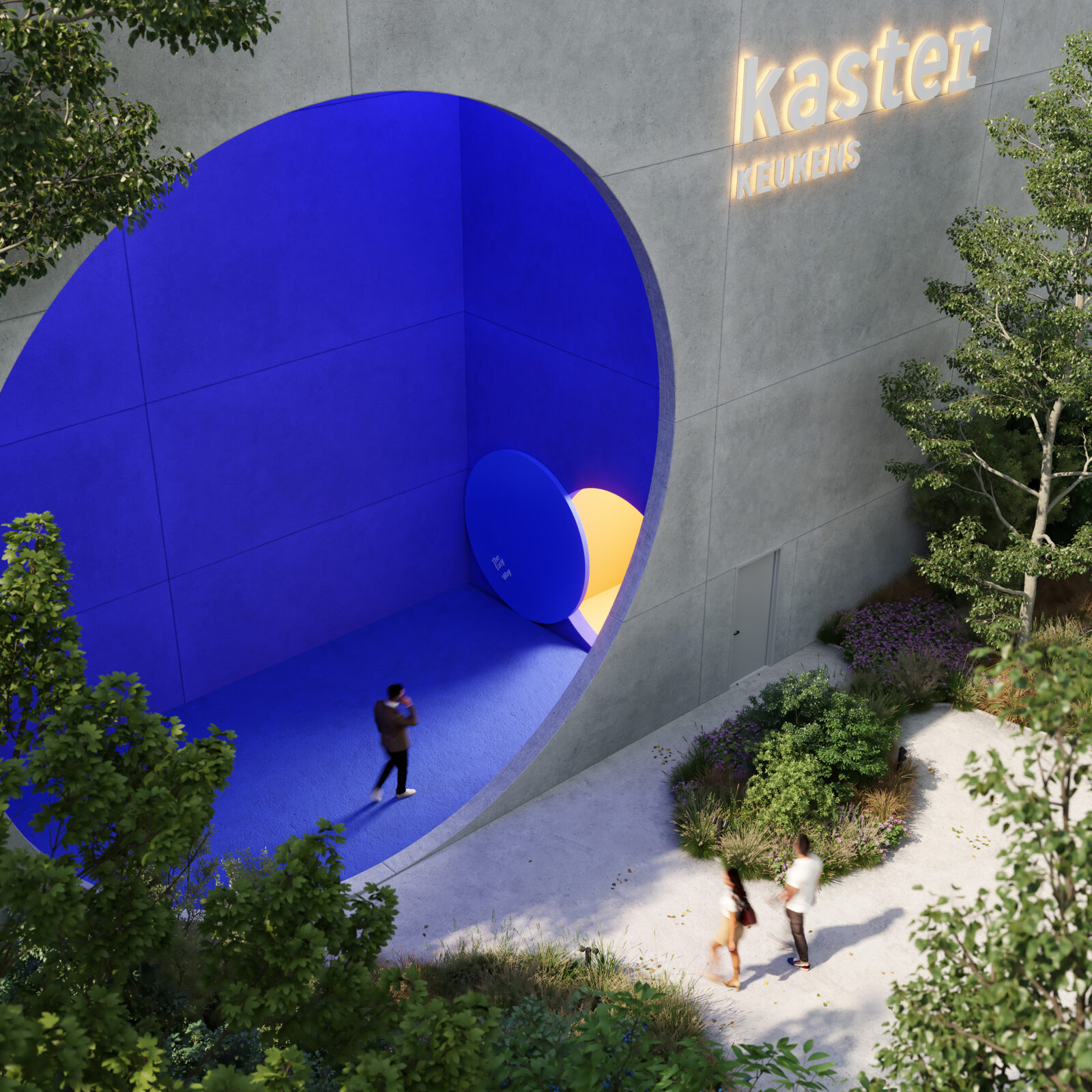
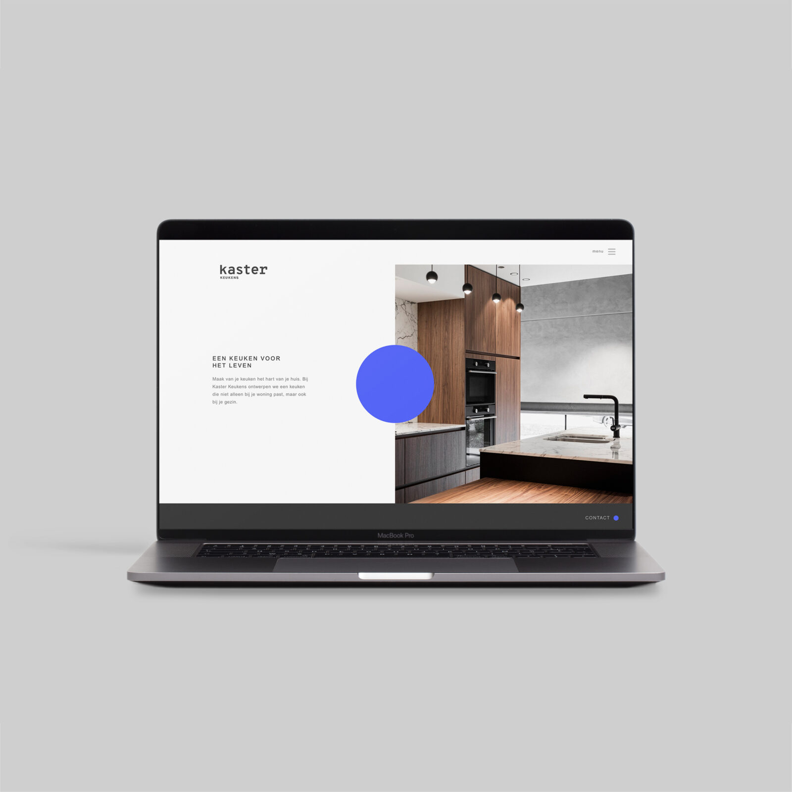
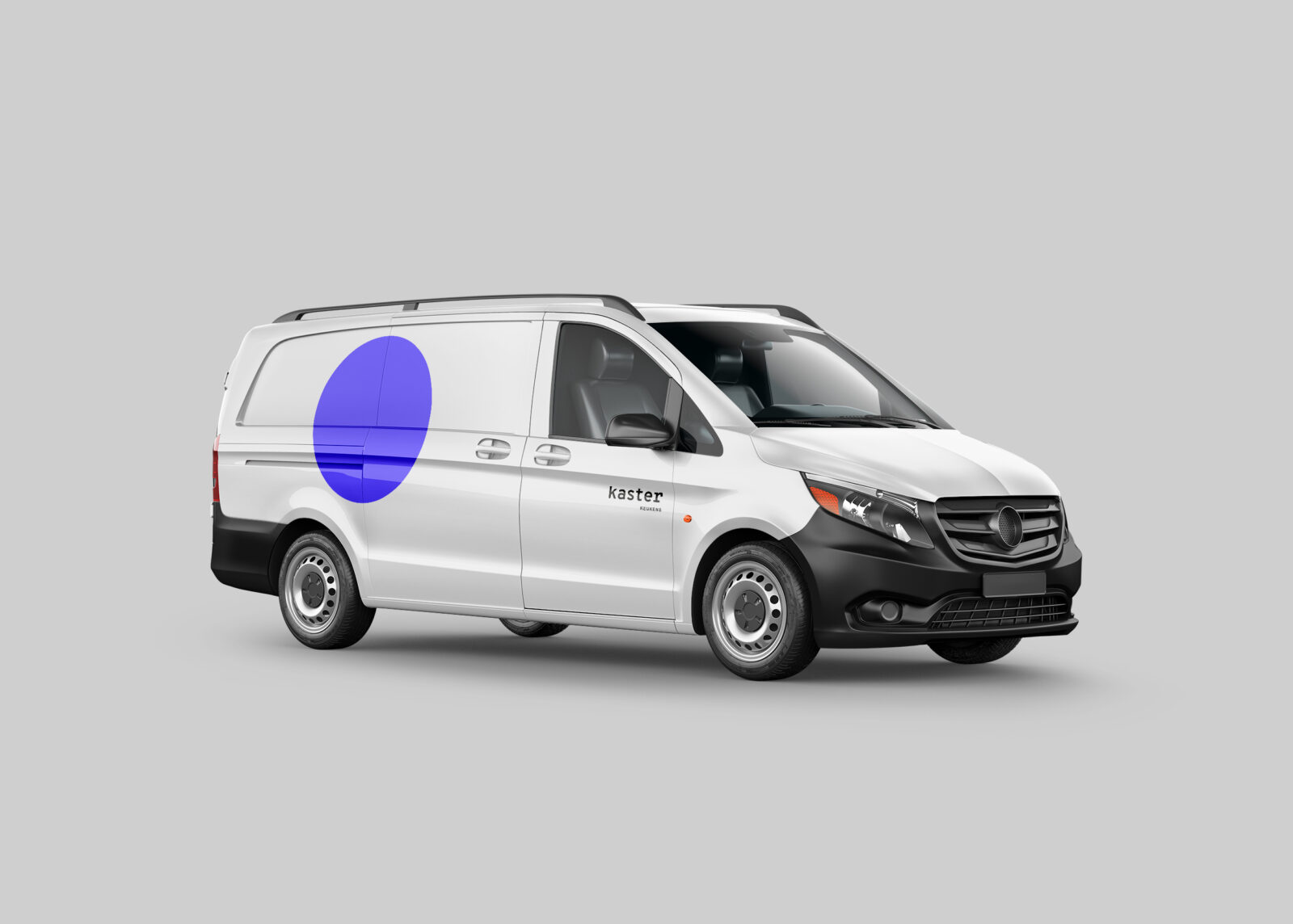
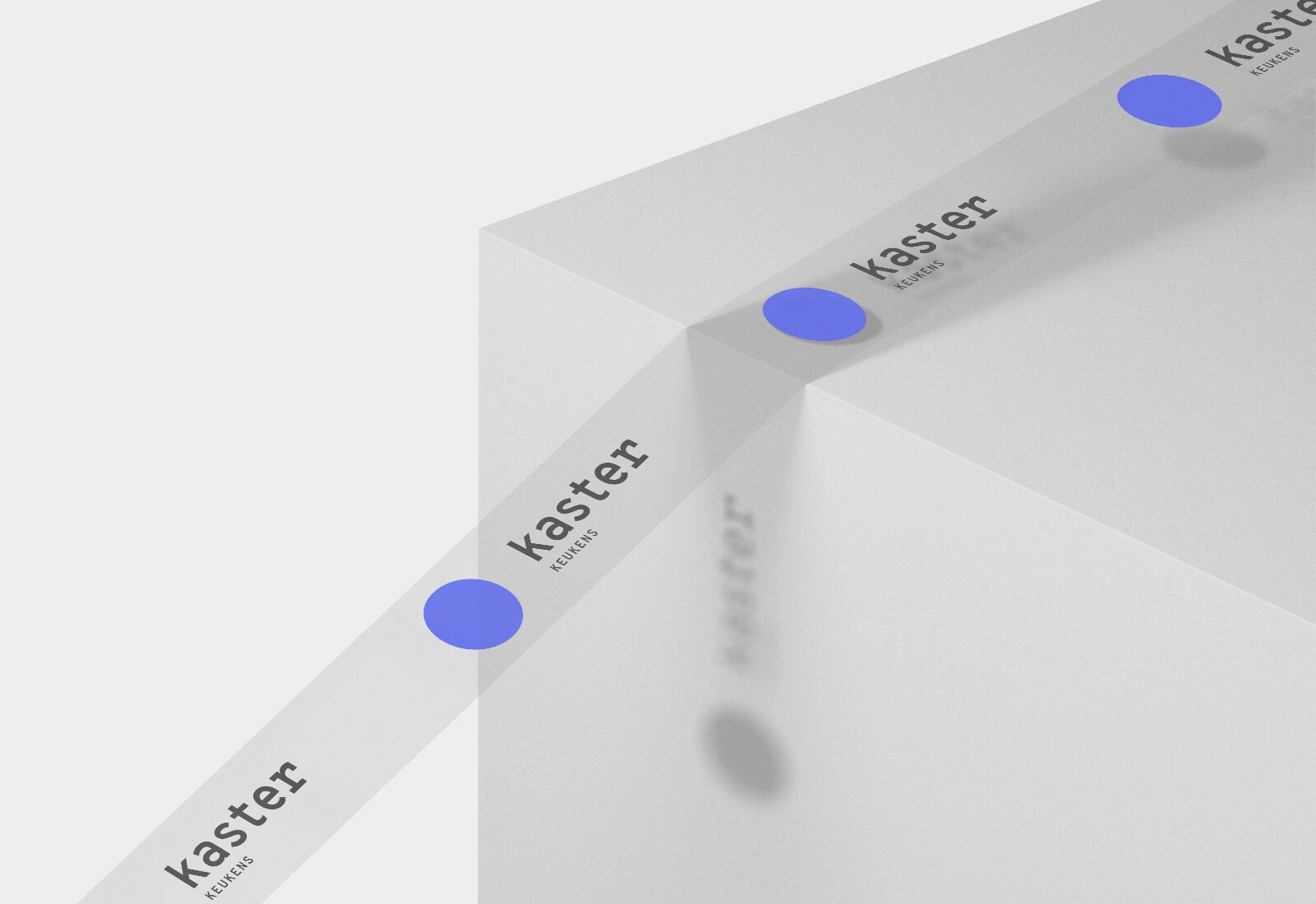
— Walking through the logo
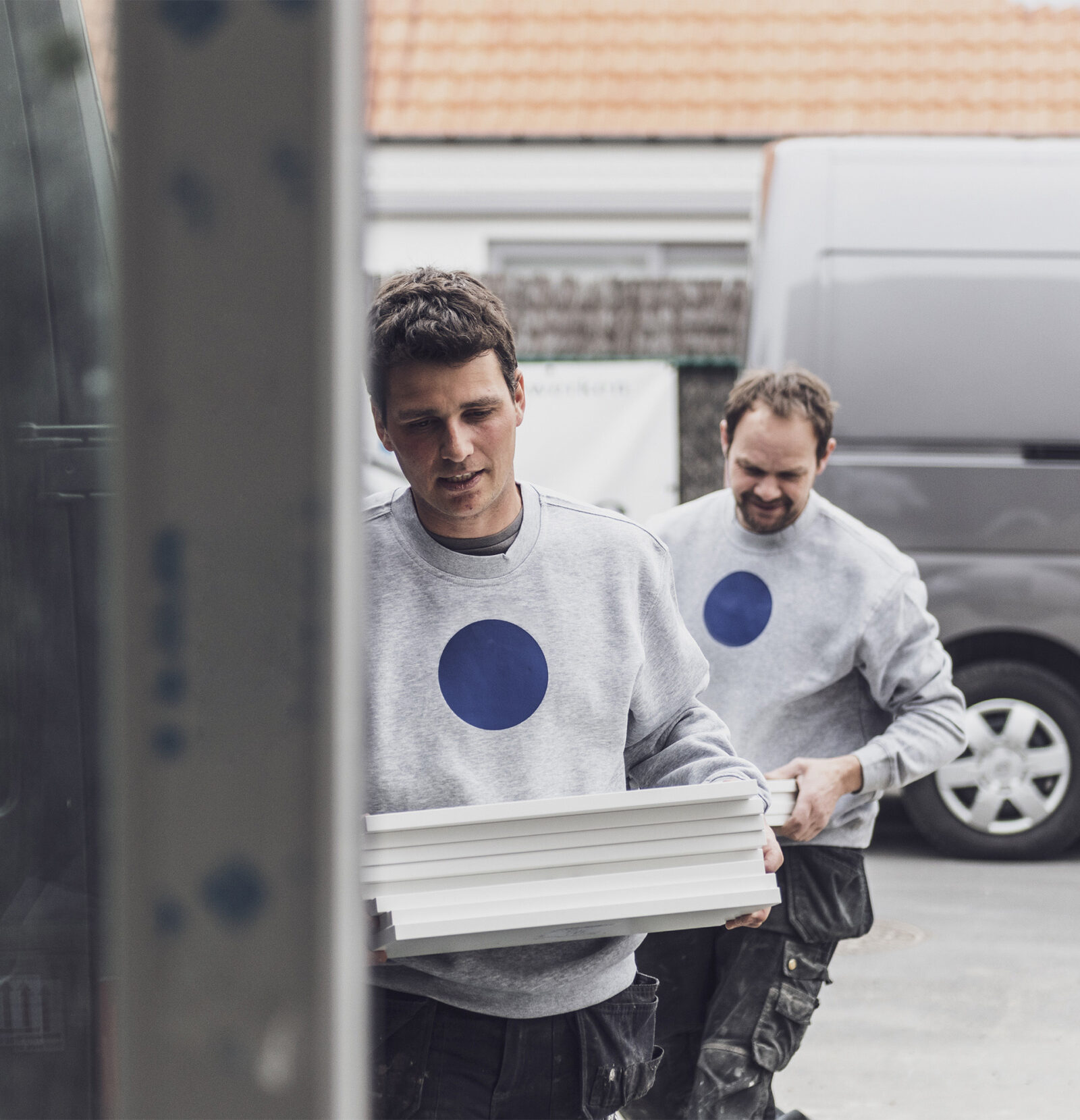
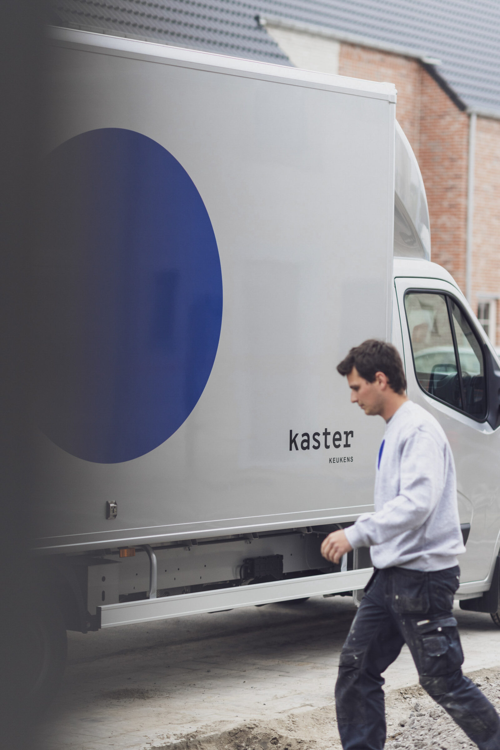
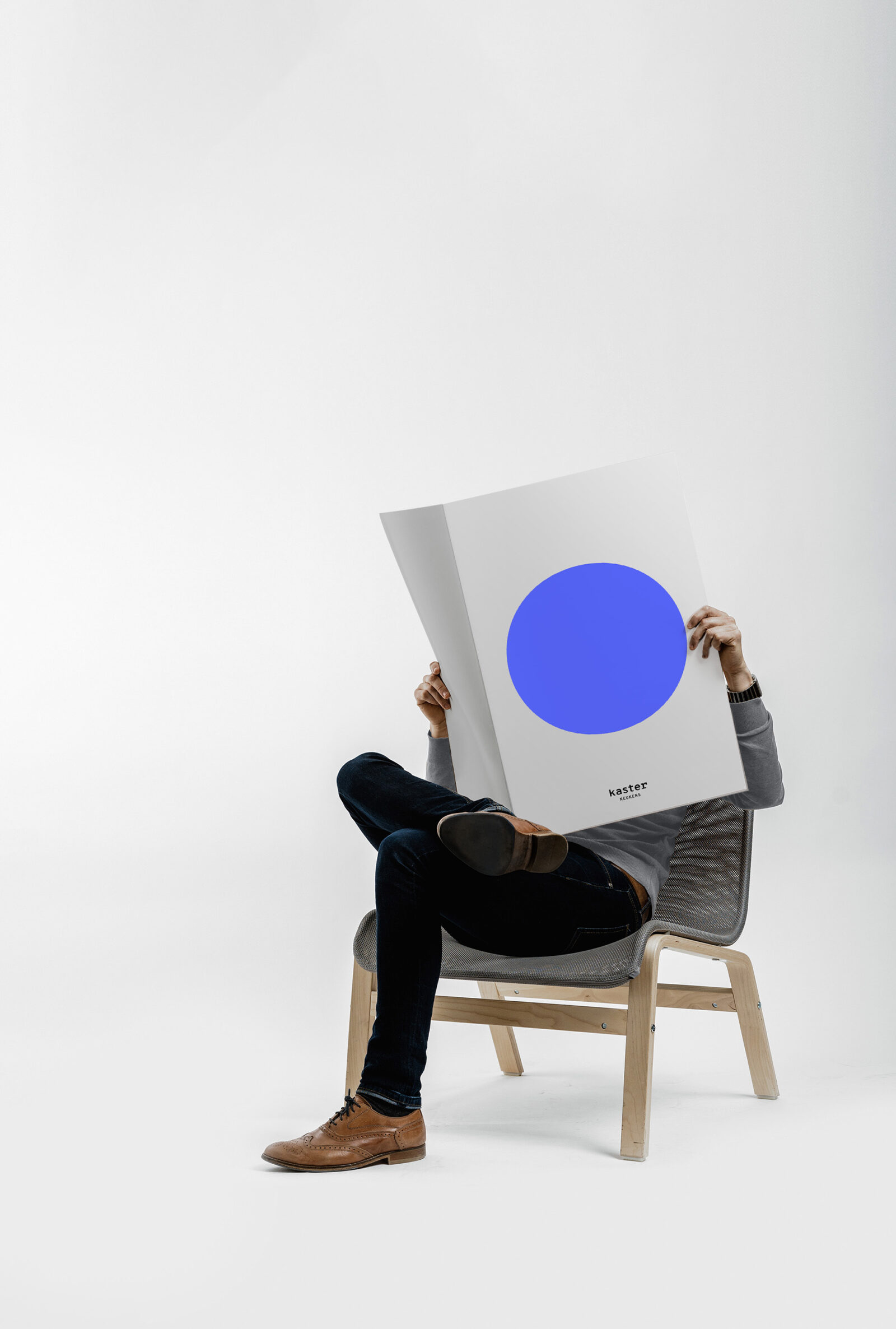
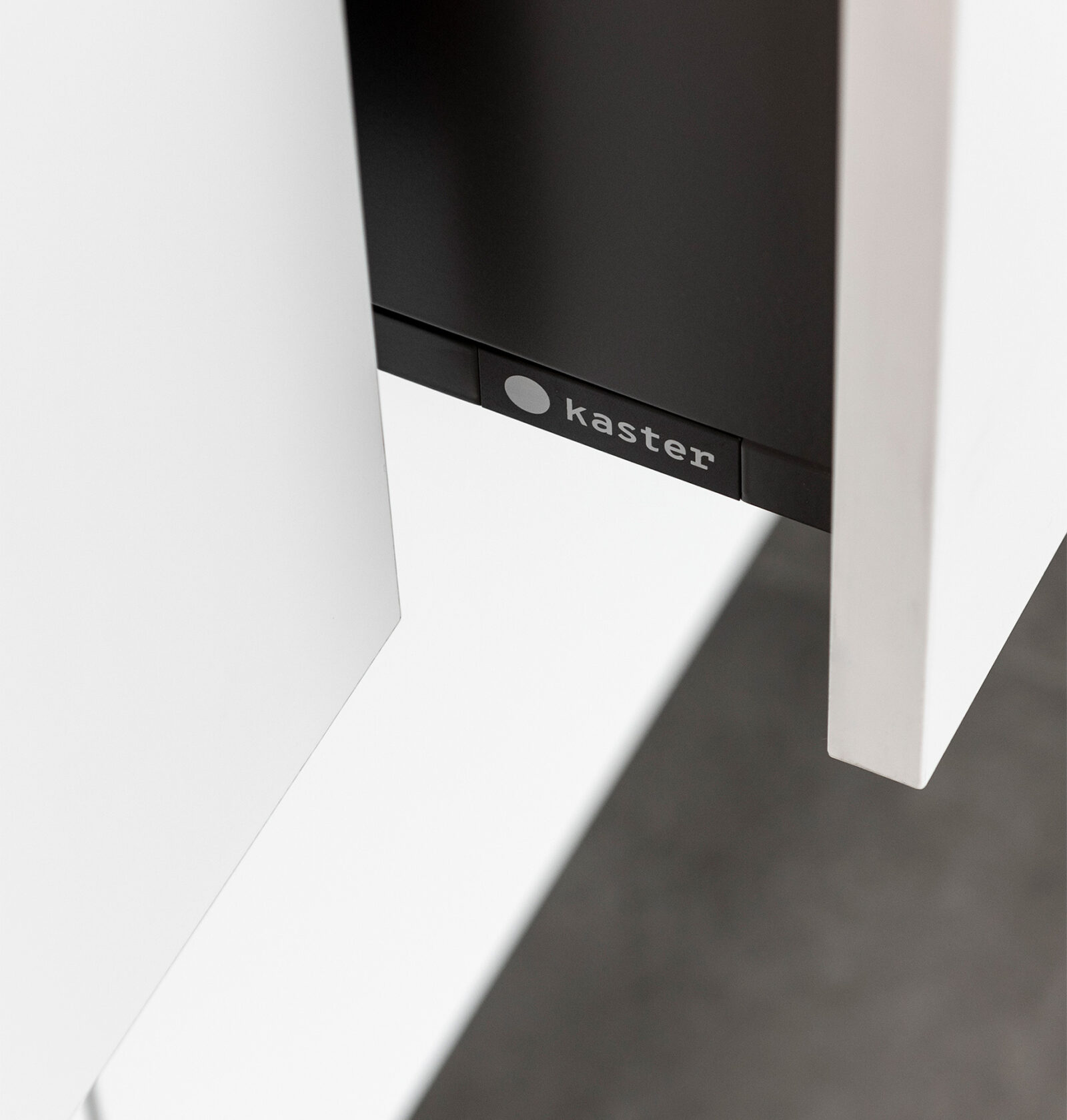
In this case, we took submerging the visitor in branding quite literally. We chose to have the visitor walk through the Kaster logo. We created great recognisability by keeping the design of the logo extremely simple – a blue circle. Both outside and in their head offices. We did not only handle the entrance, but the interior too was a fully custom design in line with the branding.